


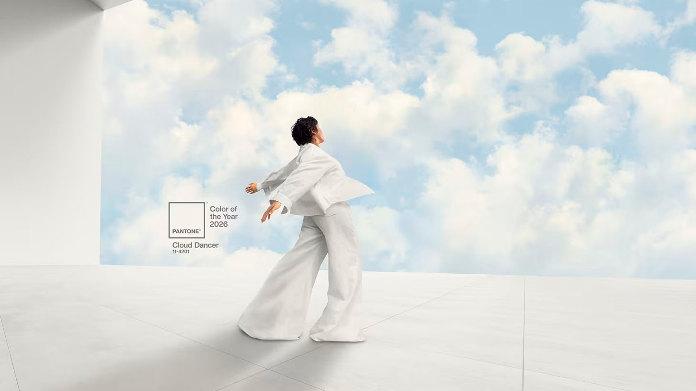
Last December, the Pantone Institute surprised the design world with an unusual yet profoundly meaningful choice: Cloud Dancer (PANTONE 11-4201) as the Colour of the Year 2026. This serene and neutral white represents calm and clarity in a world full of noise and constant visual stimuli.
Neither a 'blinding' pure white nor a cold laboratory white, Cloud Dancer is described as a shade that is somewhere between a breath of fresh air and a whisper of serenity. It invites quiet reflection, concentration and creativity.
At Muebles Belhogar, we believe that understanding how this colour translates into practical furniture is key to making good decisions when furnishing a home.
More than a colour, it is a statement of intent.
Pantone does not choose a colour at random. Each choice is based on studies of behaviour, consumption, well-being and lifestyle. The Colour of the Year 2026 reflects a clear trend towards more balanced and warm homes connected to personal experience.
This translates into a palette that evokes calm, stability and comfort, moving away from jarring contrasts or fleeting fashions. In furniture, this philosophy has a direct impact.
The influence of Pantone Colour 2026 on furniture design
Unlike in previous years, colour does not take centre stage in 2026, but rather blends in. We are not talking about 'trendy' furniture that quickly becomes tiresome, but rather pieces designed to last and adapt to everyday life.
Manufacturers are opting for fabrics that feel homely and enveloping, never garish. Sofas, armchairs and easy chairs incorporate shades inspired by Pantone Colour 2026, featuring textile finishes that are pleasant to the touch and designed to create cosy, timeless environments.
Wood and lacquer in harmony
Living room furniture, such as sideboards and tables, combines colour with natural woods and visible grain, as well as soft lacquers. The aim is not to stand out, but to complement the space as a whole and provide visual balance.
Bedrooms that invite true rest
This influence is most noticeable in the bedroom. Headboards, chests of drawers and bedside tables feature subtle versions of the colour of the year, promoting a sense of calm, order and well-being.
Why does this trend fit so well in today's homes?
The 2026 consumer is looking for something very specific: a way to feel good at home without compromising on design. The Pantone Colour of the Year meets this need because it encourages smart choices rather than radical changes.
Furthermore, it is a versatile trend that works in both modern and classic homes as it easily adapts to different decorative styles.
How can this trend be applied without going overboard?
One of the most common mistakes is to use the trend colour excessively. When it comes to furniture, less is more. Based on our experience, we recommend:
• Introduce the colour in one or two key pieces.
Combine it with neutral tones and natural materials.
Opt for quality furniture that does not rely solely on colour to stand out.
At Muebles Belhogar, we help our customers to interpret these trends in a practical way, adapting them to their space, lifestyle, and real needs.